
Untangling the Menu: A UX Journey from Nested to Mega
Role
Lead designer
Product Trio: Worked with Product Owner and Dev team to strategize the final solution
Activity
Joined after the core design was set, focusing on a flexible solution to support a dynamic number of menu links.
Evaluated breakpoints, interaction logic, and visual design across varying menu sizes.
Served as a liaison to communicate and align design strategy with stakeholders and cross-functional teams
Impact
Adopted across ADP, impacting over 1 million users
Awarded patent for dynamic menu system
Still in use after 8 years with no major changes
background
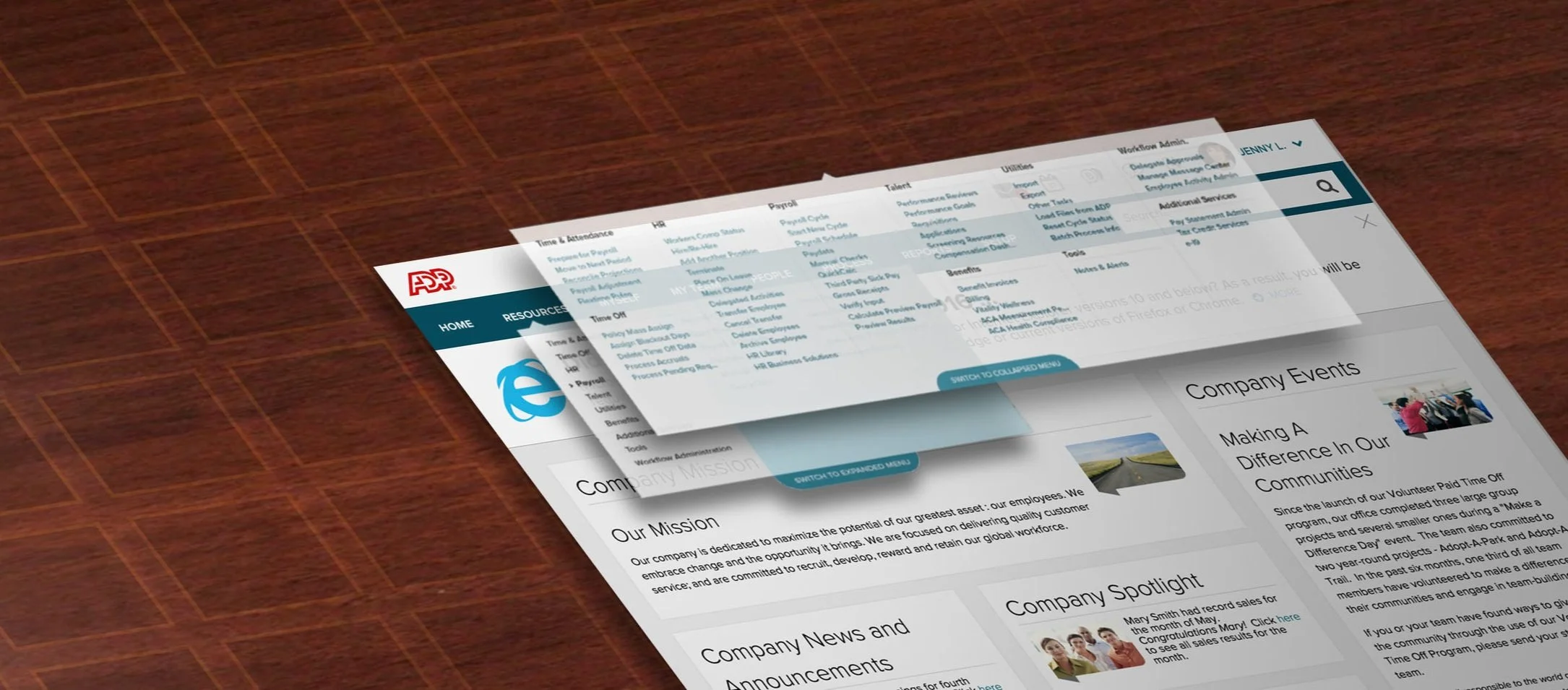
Clients struggled to find content within the ADP navigation menu.
The menu required users to select a main category, then drill down into subcategories - each containing a large bucket of links.
Challenges of a Nested Menu
While some users navigated smoothly, others got stuck. Without clear Category > Subcategory groupings, users had to hunt through every category to find what they needed.
Approach
Information Architecture: Unbucket and Expand
An expanded content structure proved easier for users to find what they needed
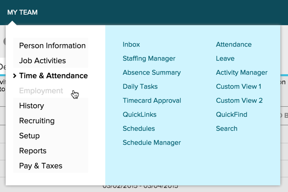
Labels such as “My Team” vs. “People” meant different things to different users, and updating naming conventions didn’t fully resolve the confusion.
We tested an expanded, “unbucketed” menu that put everything in front of users - they responded fairly unanimously, being able to complete task at a rate about 80%.
Note: I joined once the expanded menu strategy was in place and focused on execution challenges related to a dynamic, personalized menu.
Toggle Switch: Giving Users Control
Most users favored the expanded view, but some still preferred the familiarity of the previous menu.
To accommodate different preferences, we added a switch that lets users toggle between the original nested menu and the expanded version.
Early testing showed the toggle was easy to overlook, so I redesigned it to be more obvious - users now noticed itn and used the toggle as intended.
Initial toggle pattern : Users found it difficult to notice during research
Redesigned Toggle pattern : Breaking the square shape helped user notice the new toggle design
challenge : designing for scalable layouts
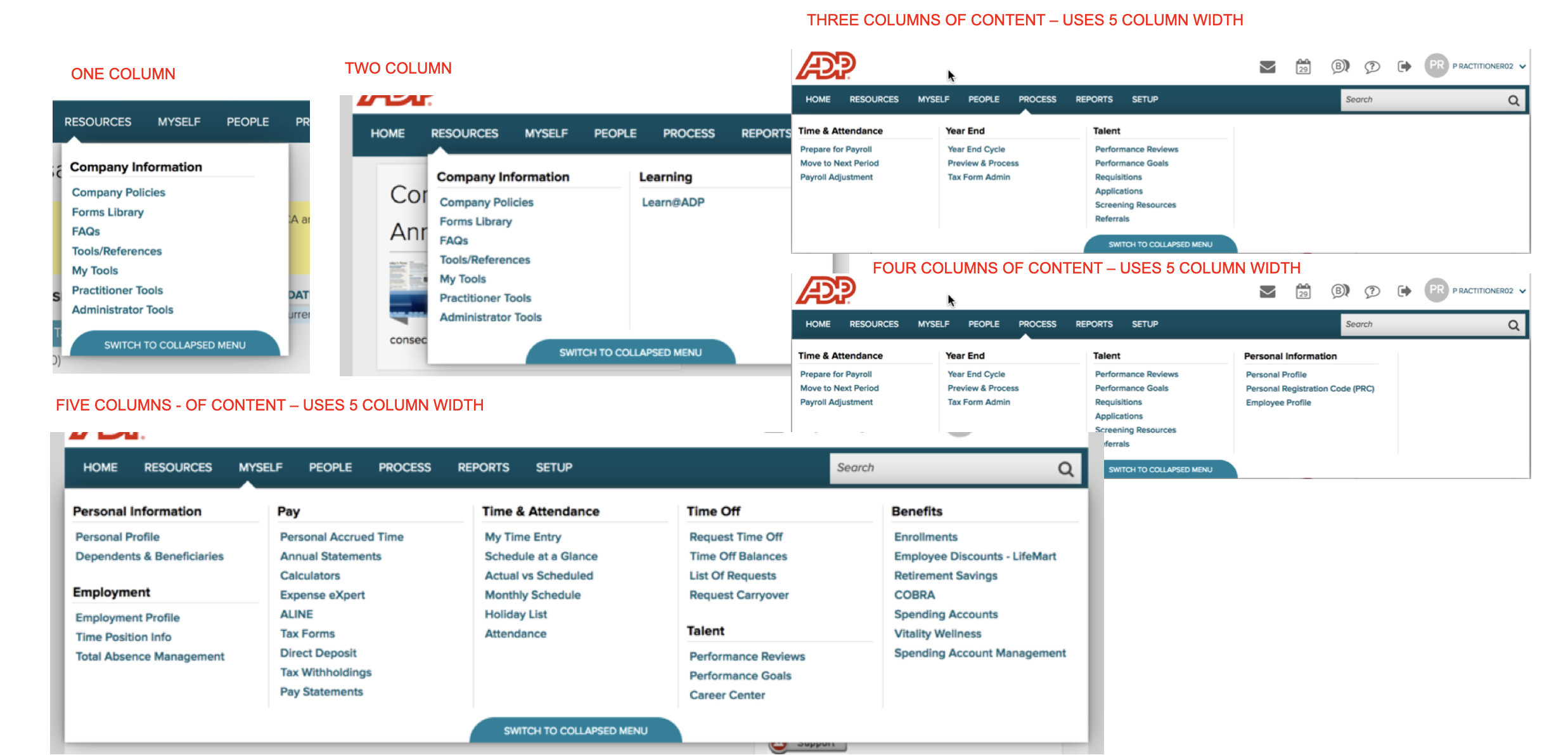
The main challenge was designing the menu to work with anywhere from 10 to 40+ items.
We needed specific rules to keep the menu clear and consistent at any size.
-
Content will flow from Top to Bottom, Left to right.
Expanded view exposes all 2/3 content at once
Maintain the order of level 2 and 3 items without reshuffling
All level 3 items under one level 2 will be kept in one column – Level 2 items will not be broken into two columns
Expanded menu has three breakpoints: 1 Column (one level 2 item), 2 column (two level 2items), 5 column (three or more level two items)
Create layout with goal of reducing “uncomfortable” whitespace. The height is variable and set at the tallest column of Level 2 and Level 3 items.
We established clear rules for transitioning content from the collapsed view to the expanded menu.
Top level items became section headers, with associated links listed beneath.

Creating Scalable Layouts
I worked closely with Product and Dev to define logical and visually balanced breakpoints for the expanded menu.
I led the effort by mapping out a matrix of layout scenarios, highlighting which designs were acceptable. As a team (UX, Product, and Dev), we weighed design quality against technical feasibility and landed on a solution that looked great and was practical to build.
Smart Stacking Strategy
Since each user sees a unique menu, we needed a dynamic solution that could stack sections intelligently based on what content showed up for them.
-
Shortest combination of adjacent 2/3 items that will accommodate new Item
If two combinations are equal select left most
The selected combination must be greater than then height of the new 2/3 item, otherwise default to height of new item.
What set this solution apart and led to both wide adoption and a patent was its flexible design and an innovative solution for handling dynamic layouts.
Adoption & Impact
The final design was implemented across ADP’s three largest products. Over time, the toggle was phased out, with the expanded view becoming the default experience.
Two patents were filed for this work, and one was successfully granted.
Example of mega menu in production
Takeaways
During design and development, we stayed in sync with teams impacted by the Menu Change, keeping them in the loop to avoid any surprises or roadblocks. In the end, the rollout went smoothly, and everyone was on board.
While the expanded menu was well-received, enough client requests to bring back the older nested menu have led some products to consider re-enabling the toggle.
We added “My Links (favorites)” to the menu so users could bookmark their favorite pages, supporting the goal of helping clients reach their objectives as quickly and easily as possible.
Search was upgraded to aid as a navigation tool. If users had trouble finding a page, search would surface relevant navigation results to guide them.