
a New Direction
My client, RapidFire Tools, was shifting focus and needed a website that reflected their new direction:
New products, a revenue-driving checkout, and an improved visual identity.
Role
Website and UX design
Branding and Creative
I had been their lead creative on previous websites and branding
Activity
Creating a clean, modern visual design
Aligning messaging with the new brand
Designing and testing responsiveness and mobile adaptability
Impact
Delivered a cleaner, more focused website
Aligned the design and messaging with the brand’s new direction
A year over year 50% increase in sales
Made navigation smoother and interactions more intuitive
Overview
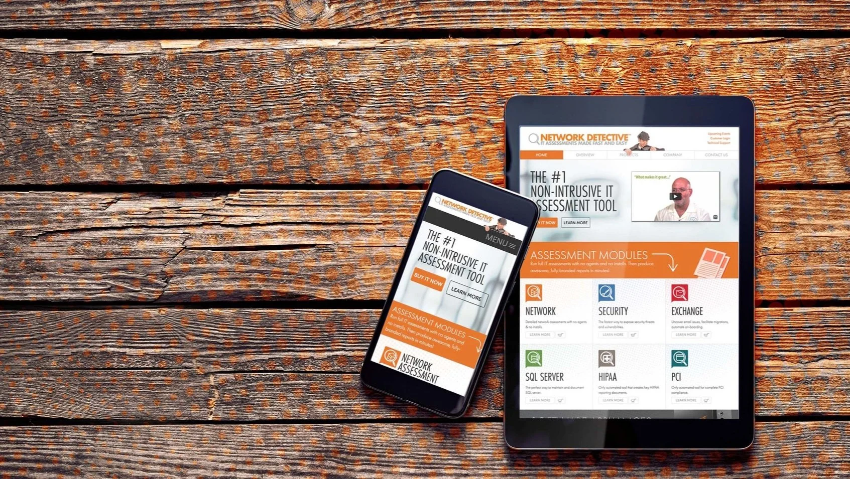
As my client rebranded Network Detective as RapidFireTools, they needed a website that reflected the new direction.
The existing site didn’t align with the updated product vision and wasn’t optimized for mobile.
I led the redesign to create a responsive, modern site that clearly communicated the new brand and performed seamlessly across devices.
The result was a cleaner, more focused web presence aligned with the company’s new direction.
Approach
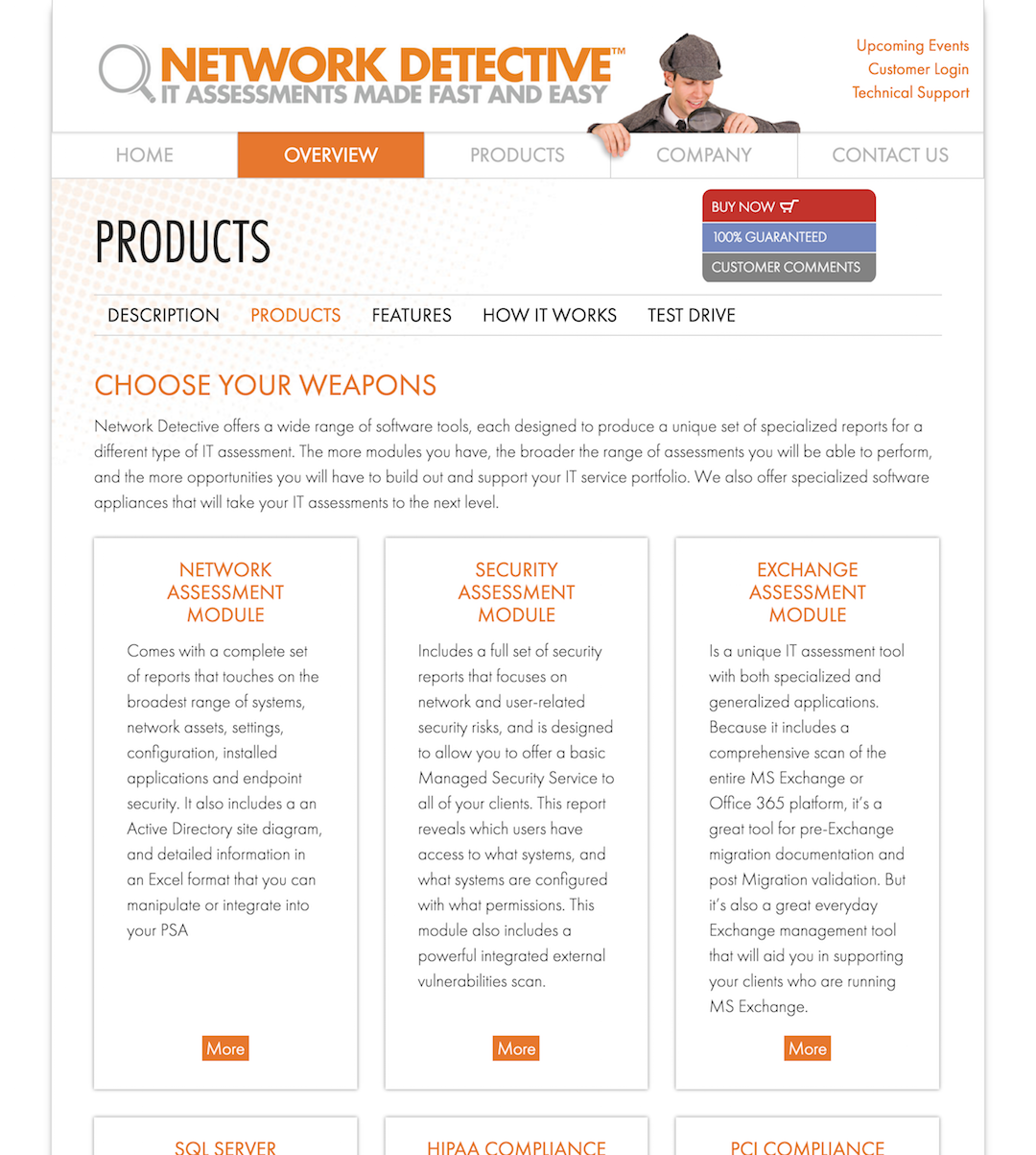
I sat down with the Network Detective team to get a clear picture of how they wanted to restructure their product lineup.
I led the product’s design through multiple iterations - through these, I had a strong understanding of where the product had been and where it was headed.
The top priorities were creating a site architecture that made it easy to move between products and building a modular product menu that could scale as new tools launched over time.


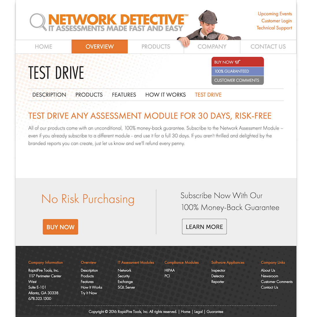
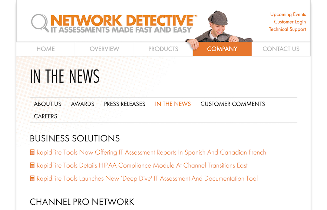
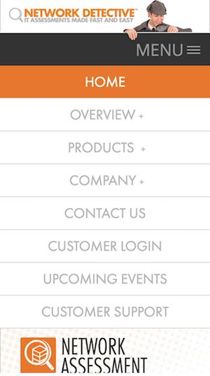
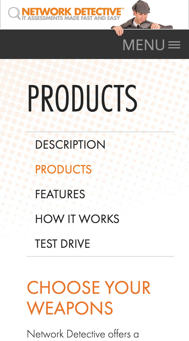
Navigation
The navigation strategy focused on helping users move easily through subtopics without relying on the top nav. To support this, I introduced a sub-menu pattern within each major section.
I designed a visual mega-menu to make products easier to discover, then added floating left and right tabs that expand on hover to help users quickly jump between products.
Together, these features made it easy to move between products and seamlessly add new ones.

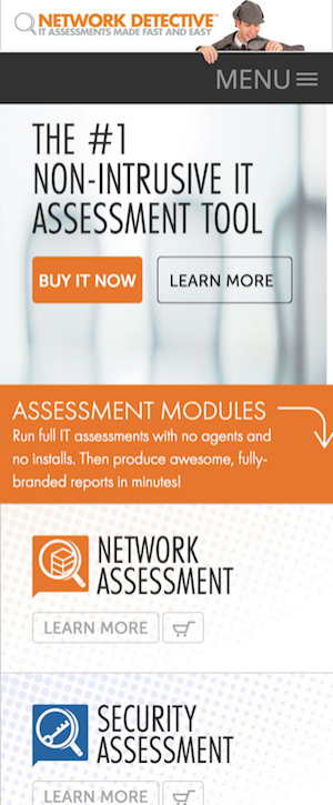
Responsive & Mobile-Ready
I approached the design with the understanding that mobile is often a user’s first impression.
The site was built to be fully responsive, with an adaptive approach applied to key areas such as the homepage, product pages, and order flow to ensure a seamless mobile experience.
While most sections required only layout adjustments, others, such as the order page, required a complete rethink of interaction patterns to better support mobile users.


Designing the Order Page
The order page is a central part of the Network Detective site, used for processing purchases.
A key feature is helping customers understand the discounts available based product selections.
One challenge was educating users about savings without making it feel like a hard sell. I focused on clearly presenting pricing, potential savings, and current discounts, without using promotional labels like “Best Deal.”
Another key challenge was clarity. Some products included optional add-ons, so I designed a clean, intuitive layout that clearly explained each selection and its associated cost.
Mobile Order Page
The next step was designing a mobile version of the checkout. Since the desktop layout didn’t scale well to a smaller, vertical screen, I created an adaptive pattern that’s different visually but keeps the core user interactions consistent.
Mobile view checkout page. This visual walkthrough was created to communicate the micro behaviors for development.
Takeaways
Maintained and evolved the Network Detective website over several years, supporting ongoing updates, UX improvements, and design consistency as the product matured.
Later brought in as a consultant during a major agency-led redesign to ensure continuity and strategic alignment across teams.
Partnered with the agency and internal stakeholders to align creative direction with the updated brand, improve UX, and clarify product messaging.
The redesign launched successfully, coinciding with a 20% increase in sales within the first year and supporting the company’s growth and eventual acquisition. ( the website redesign occured in tandem with other strategic efforts, including sales, marketing and product enhancements )