

Compliance on Demand
Comprehensive solution that helps clients easily research, understand, and stay up to date on wage and hour compliance through search, community discussions, and access to legal experts. Learn More
Role
Lead Designer
UX Architecture
Activity
Conducted analysis, developed strategic solutions, and delivered final design
Worked with dev to ensure quality of execution and interactions
Impact
30% increase in engagement, year over year( vs. previous compliance portal)
Increased Client Trust and Retention
Elevated organizational presence in compliance space
“The convenience of having one source that covers federal, state and local jurisdictions is a huge timesaver.”
Overview
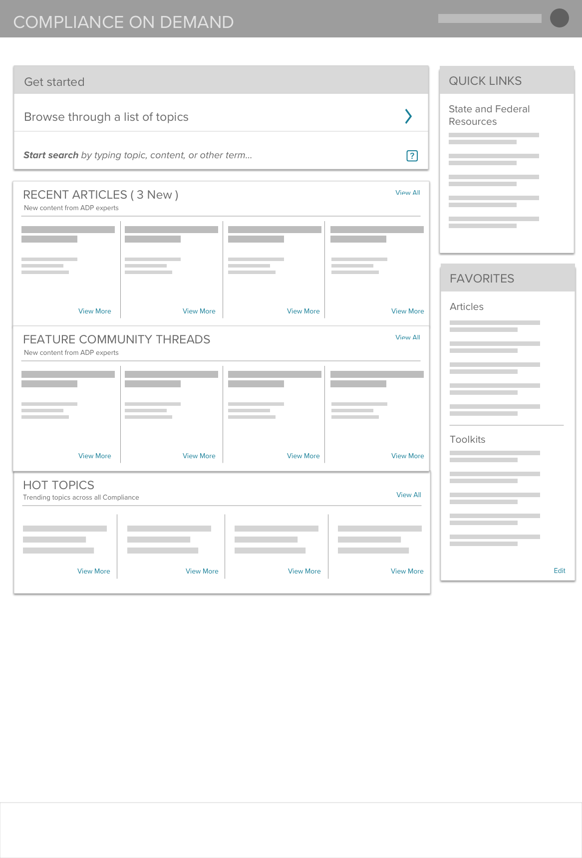
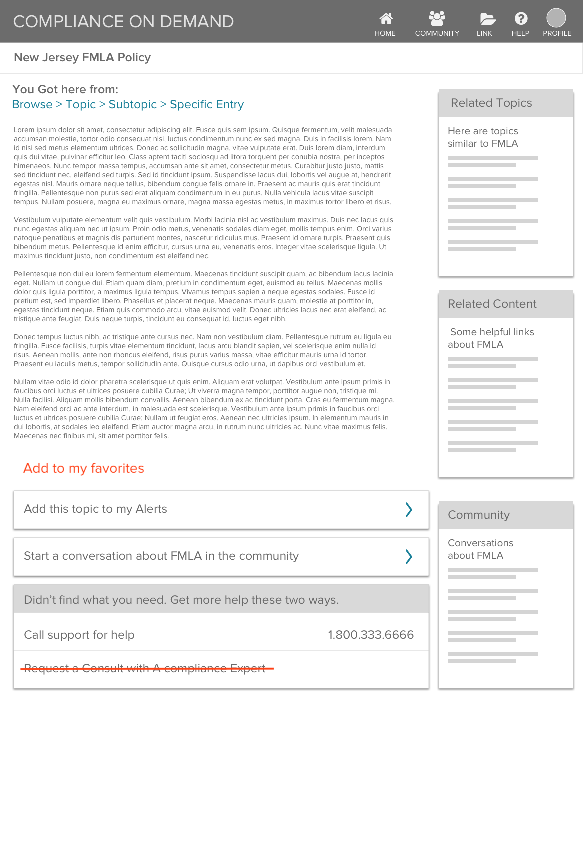
Clients struggled to find the information they needed.
The previous tool was complicated, not just because of the sheer amount of content, but because searching and finding relevant information was difficult.

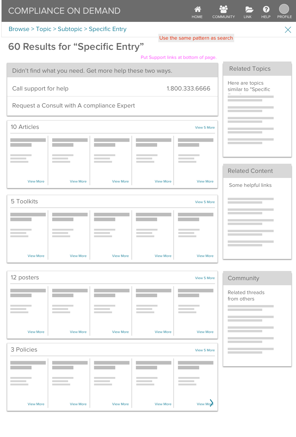
Beyond the two main entry points to browse and search, the supporting content felt random and rarely aligned with client goals. The toolkit option, in particular, seldom resonated with users.
The content structure added friction and made it harder for users to find what they were looking for.
The content structure felt overwhelming and hard to make sense of
There were no clear paths to help users find what mattered most
Attempts to find content often led to dead ends
Related content shown on pages often wasn’t useful or relevant
This entry design centered on “Toolkits,” a term that didn’t resonate with clients and caused significant confusion.
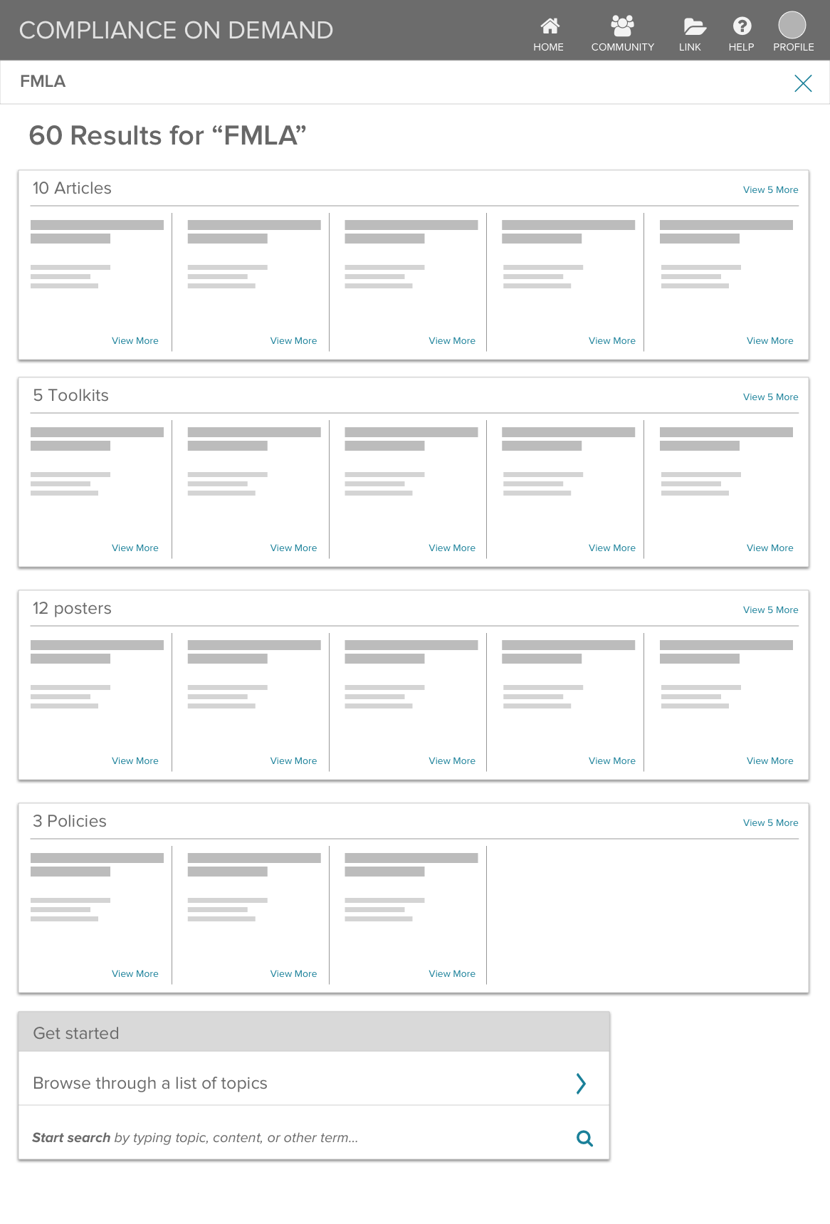
Searching forms and documents returned overly broad results without the state filters clients needed.

Approach
The compliance portal required a significant redesign, creating an opportunity to start from scratch.
Client insights directly informed design and strategy.
Starting with Research
We started with an initial survey and continued gathering input through biweekly check-ins with the product council, a group of clients willing to share feedback and insights.
Key takeaways:
Clients wanted more personalization and a smoother search experience
They needed an easy way to set preferences
The existing content experience was frustrating—most resources were only available as PDF downloads with no in-app viewing option
I stripped the content down and rebuilt the experience from there.
Simplified Content Architecture
I began by untangling the content - by thoroughly reviewing the legacy product and mapping all content types and labels.
I organized the results into nine buckets.

Form Follows Function
Finding a layout that fit the structure
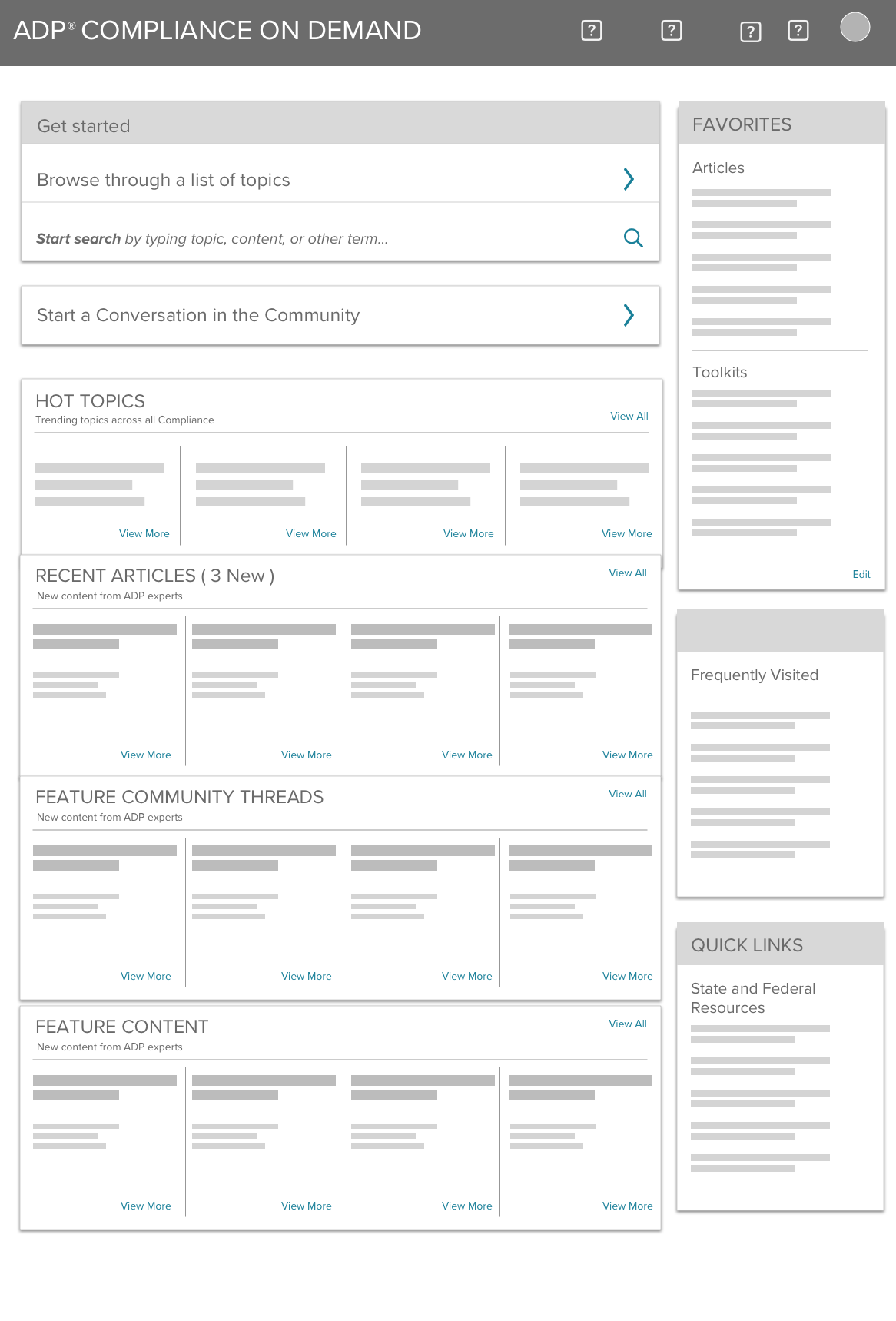
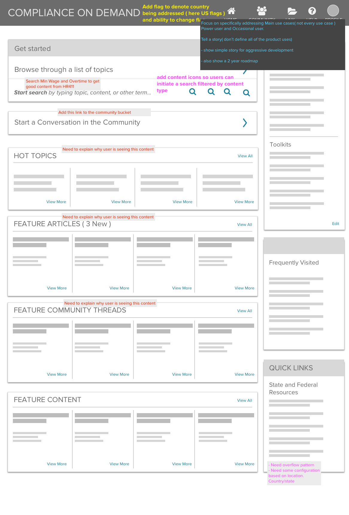
I explored the full experience in low fidelity to work through how best to reveal information to users. The homepage needed to be more than a search box, so I added dynamic content areas that surfaced information based on client preferences.

Less hunting, more finding
The goal was to make search and browse feel simple, obvious, and easy from the start.
A false Start
My early concepts focused on quickly switching between search and browse, but this approach confused users and received negative feedback.
Separate search and browse sections tested well with users
The Clear Winner
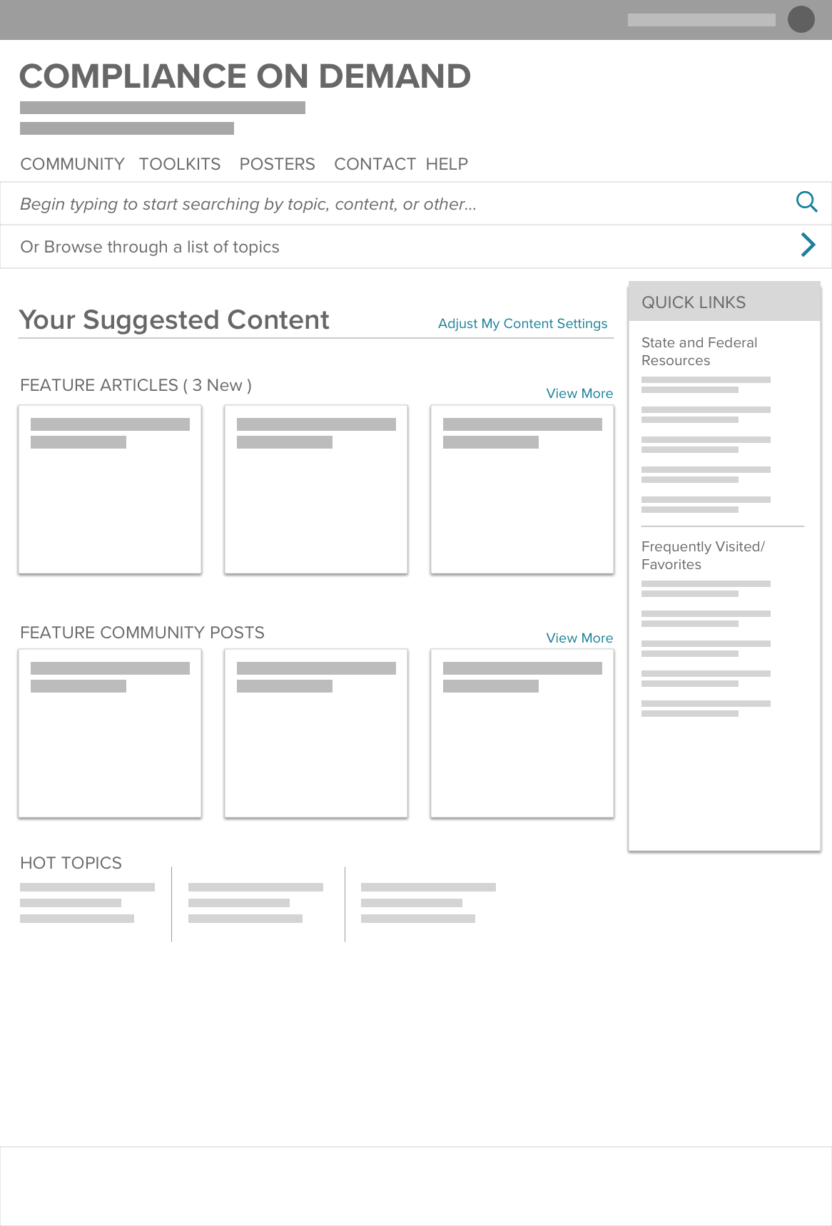
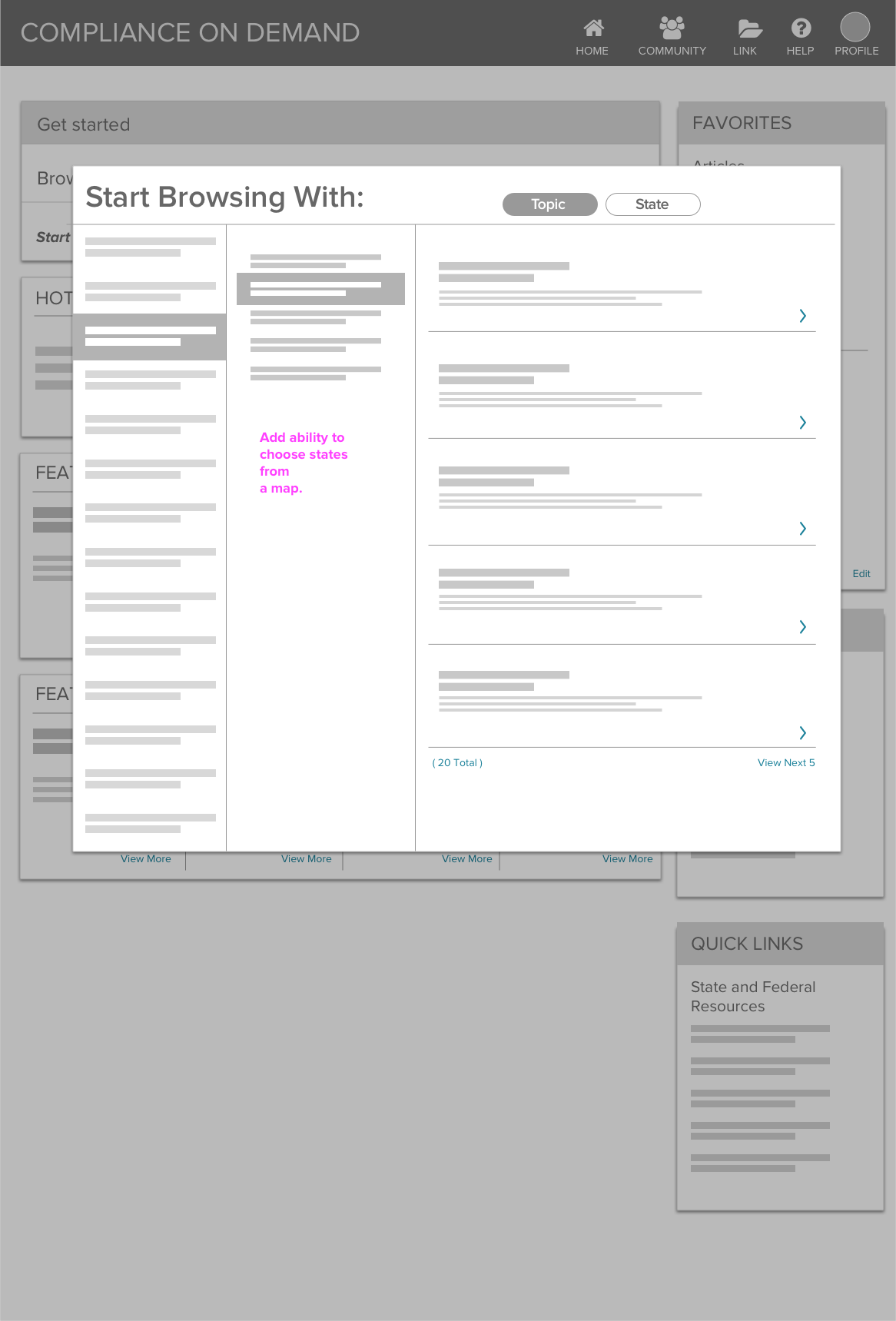
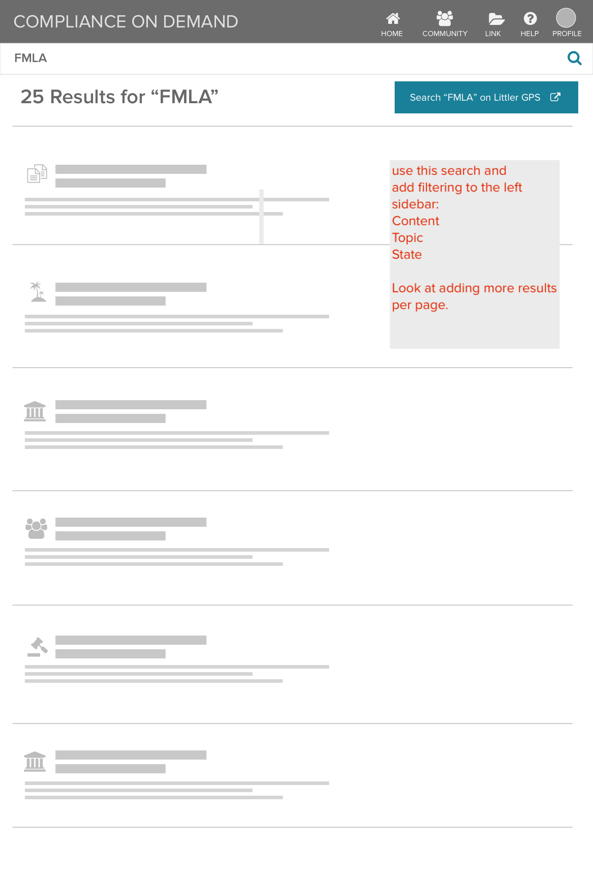
Search was separated and a dedicated Browse section was added for different content types, with short descriptions to clarify what each one offers.
Search results are clearly presented with descriptions, and the content type is clearly identified.
After searching or browsing users can refine results by managing content types and other criteria.
The feature launched with this design, addressing several gaps raised by clients. I partnered closely with engineering during the build and later designed the service logo.
Final output
Scalable, Flexible Design
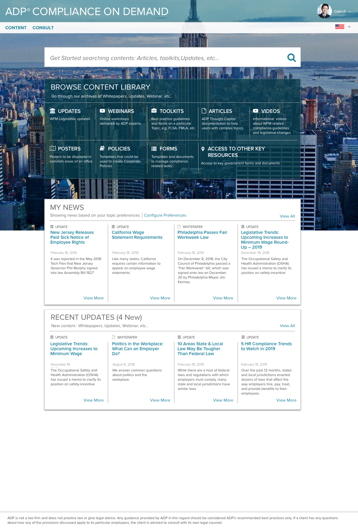
Easy entry points for Search and Browse.
Based on metrics and user testing clients two main goals are search and browse. Search rated higher as a goal - it’s showcased at the top of the page.
For browsing, we present detailed descriptions of the content types.
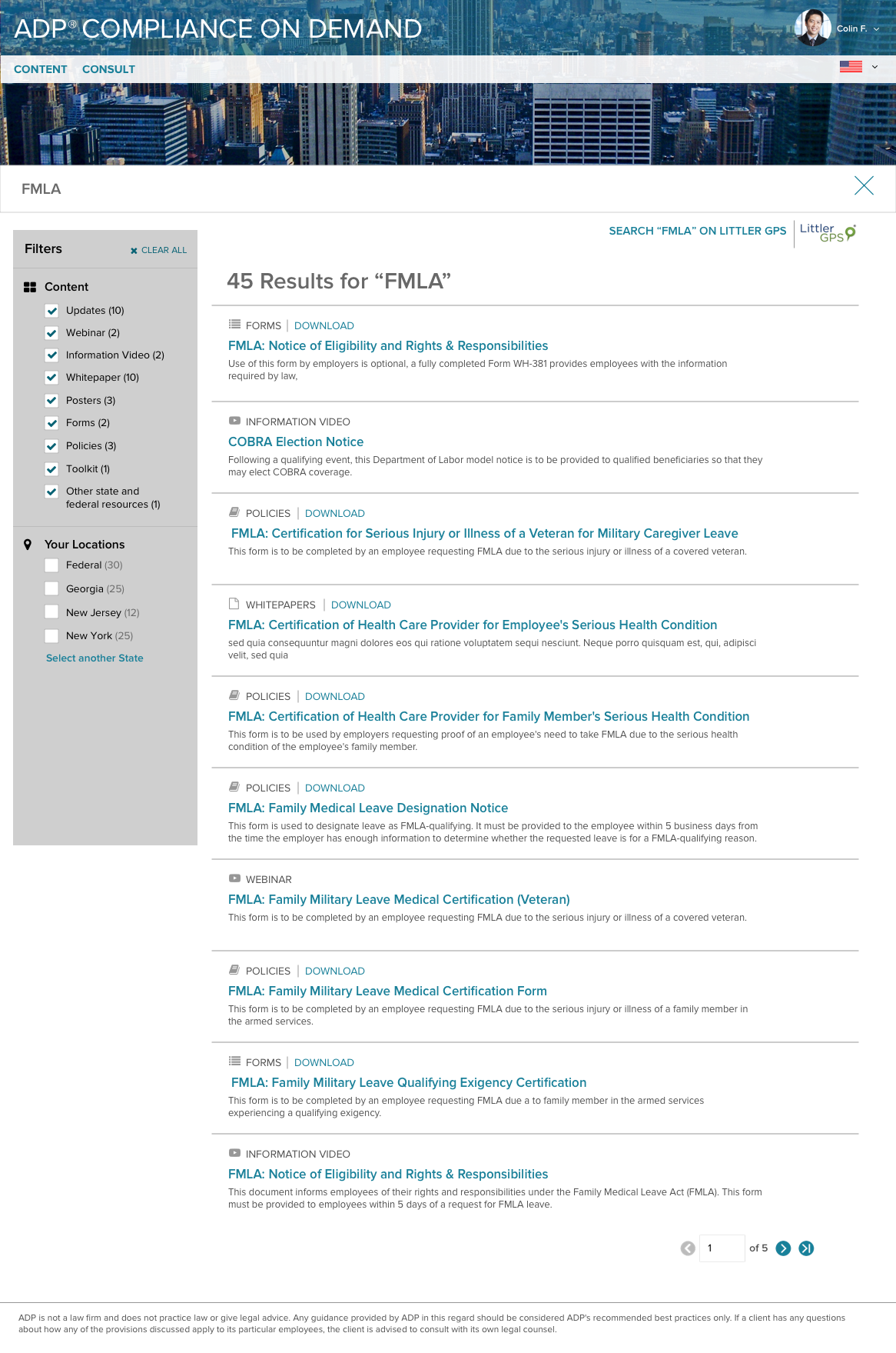
Easy to refine Search Results.
Users can refine searches easily by selecting content types or location.
Additional features allow clients to add favorites, schedule updates for specific issues, and link to related content for improved workflow efficiency.
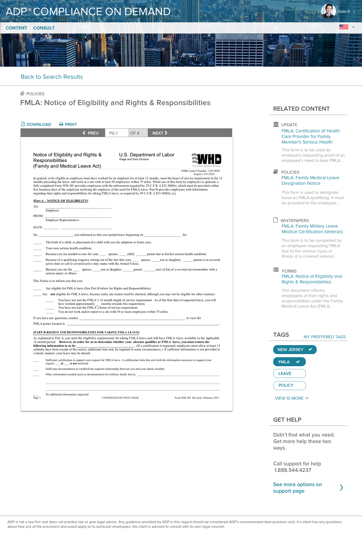
The right info
Along with the information they searched for, users can explore related content and customize their experience by selecting tags they’re interested in.
Takeaways
Several enhancements were designed but scheduled for a later release: a Community Forum, Automatic Updates, and Law Consultation.
By working through content and layout early, we stayed aligned with development and set up a structure that’s easy to update and maintain.
A strong foundational structure enabled the experience to evolve over time, including several updates and a transition to a new design system.
Client feedback was highly positive, with clients reporting it was much easier to find the information and content they needed.
Previous Project
Approvals Dashboard
Next Project