
Workday success plans* - From Fragmented to Focused
As the dashboard moved to a new design system, the primary challenges were team misalignment, limited customer understanding, and uncertainty about where improvements would create real value.
* Workday Success Plans is a subscription-based service that helps organizations maximize the value of Workday ( including implementation assistance, learning and training, enhanced cased management, and more )
Role
Lead Designer
Discovery & Research
Sprint level adjustments with Dev Team
Content creation( with Business Team )
Activity
Led a cross-functional project kickoff and set a consistent weekly cadence, aligning stakeholders and identifying key SMEs
Conducted client interviews to find insight and validate final designs
Worked with stakeholders to translate research and UX goals into practical strategies and confident decisions
Impact
Expected ~$3M in incremental revenue through improved retention and engagement
Established an AI strategy along with a documented roadmap for future enhancements
Led a less UX-mature team, helping them make more informed, user-centered product decisions ( and revealed the value of talking directly to clients )
Background
No clear owner. No direct client insight. Lots of assumptions.
Without a shared direction, clear product leadership, or regular customer input, the team struggled to make confident decisions.
This created an opportunity to bring structure to the team and focus the work on changes that would have real impact.
Turning Many Voices into One Plan
I established a twice-weekly rhythm with key stakeholders to build shared product understanding and define how we’d address gaps.
I facilitated a kickoff workshop to align the team and uncover early insights and risks. As a new member of the project, this created a clear baseline for goals, ideas, and expectations across a team that had not been closely aligned.
ux and product strategy
Herding the Insights - I spoke with clients and organized feedback into clear themes
( I partnered with another UX teammate for this task )
Manage & Optimize
Metrics & Reporting
Ask-an-Expert
Year-End Reporting
Self-Service
Learning & Training
Roles & Permissions
Now, Next, Later framework
Stakeholder conversations, along with some follow-up work helped define the finalized approach.
To help simplify team deliberation, I framed options as Now, Next, Later, helping distinguish what to tackle immediately versus what could wait.
The most immediate needs were identified in the following areas:
Refined the existing navigation and naming to better reflect how users actually want to use the service
Insights on usage to better help manage and optimize usage of the service
A more robust activity tracker in regards to learning and education- admins want to know their team is attentending useful trainings and learnings
Robust metrics and reports - clients indicated the more information they can track and report on the better
Can I close my tab?
I created an early conceptual model to align stakeholders on navigation and tab structure.
I wanted to reduce the risk of surprise pivots later in the process
(a momentum killer I had experienced on past projects)
This initial idea grouped Activity and Plan Info into a single tab under Plan Info. Further discussion led us to split them into separate tabs to better meet user expectations and business goals.
Strategy Before Screens
I used the following wireframe to present a UX strategy surfacing insight cards positioned above main content.
I intentionally kept designs at the wireframe level to focus conversations on ideas and structure rather than visual design choices.
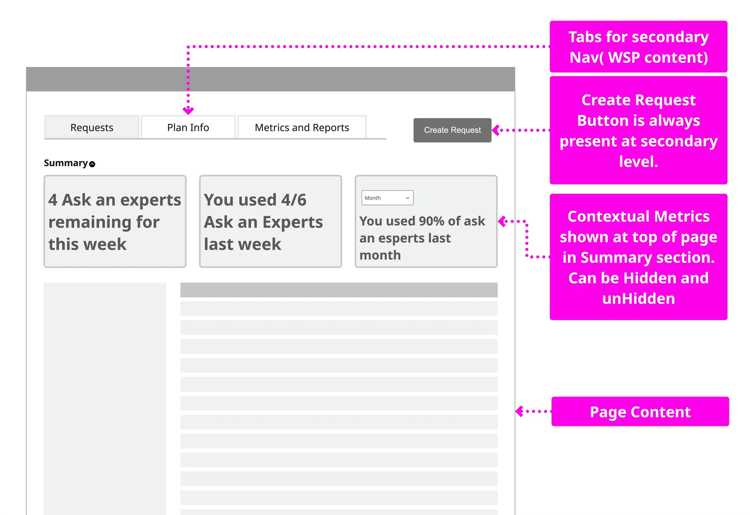
I explored multiple concepts and landed on this approach for it’s extensiblity and simplicity of execution - view more concepts
Tiny Cards, Big Clarity
A significant value add are the insight cards that give data points helping client manage and optimize their WSP team efforts.
Working with Business and Dev teams, we defined the content that would display as information became available, giving Dev early visibility into upcoming information, interactions, and challenges.
Reality… Meet Constraints
News and Insights was intended to use AI to highlight underused features, but when AI wasn’t ready for launch, we pivoted to News and Announcements to support custom updates created by the business team.

Last Call (or “final cut” )
The final design reflects a lot of client input, team collaboration, and a few well-earned debates.
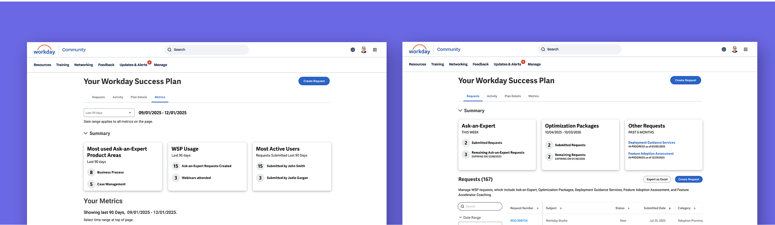
The experience is organized into four functional tabs: Requests, Activity, Plan Details, and Metrics.
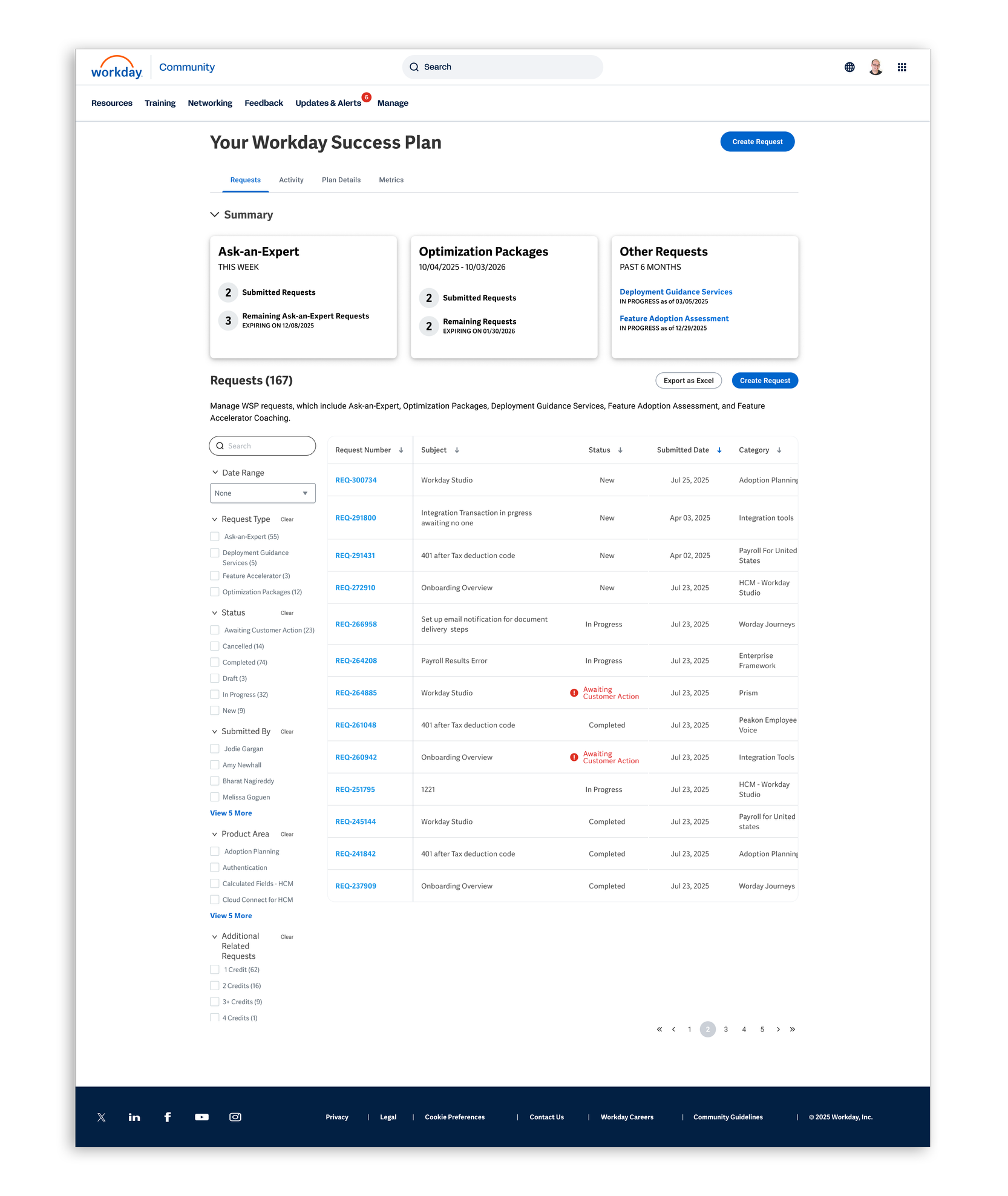
Requests Tab
Roughly 80% of WSP revolves around Ask-An-Expert requests, with five resetting each week.
In follow-up research, clients responded well to a simple insight card showing how many requests remained, often saying it mattered more than seeing completed requests.
They appreciated the extra visibility without the experience feeling heavy or cluttered.
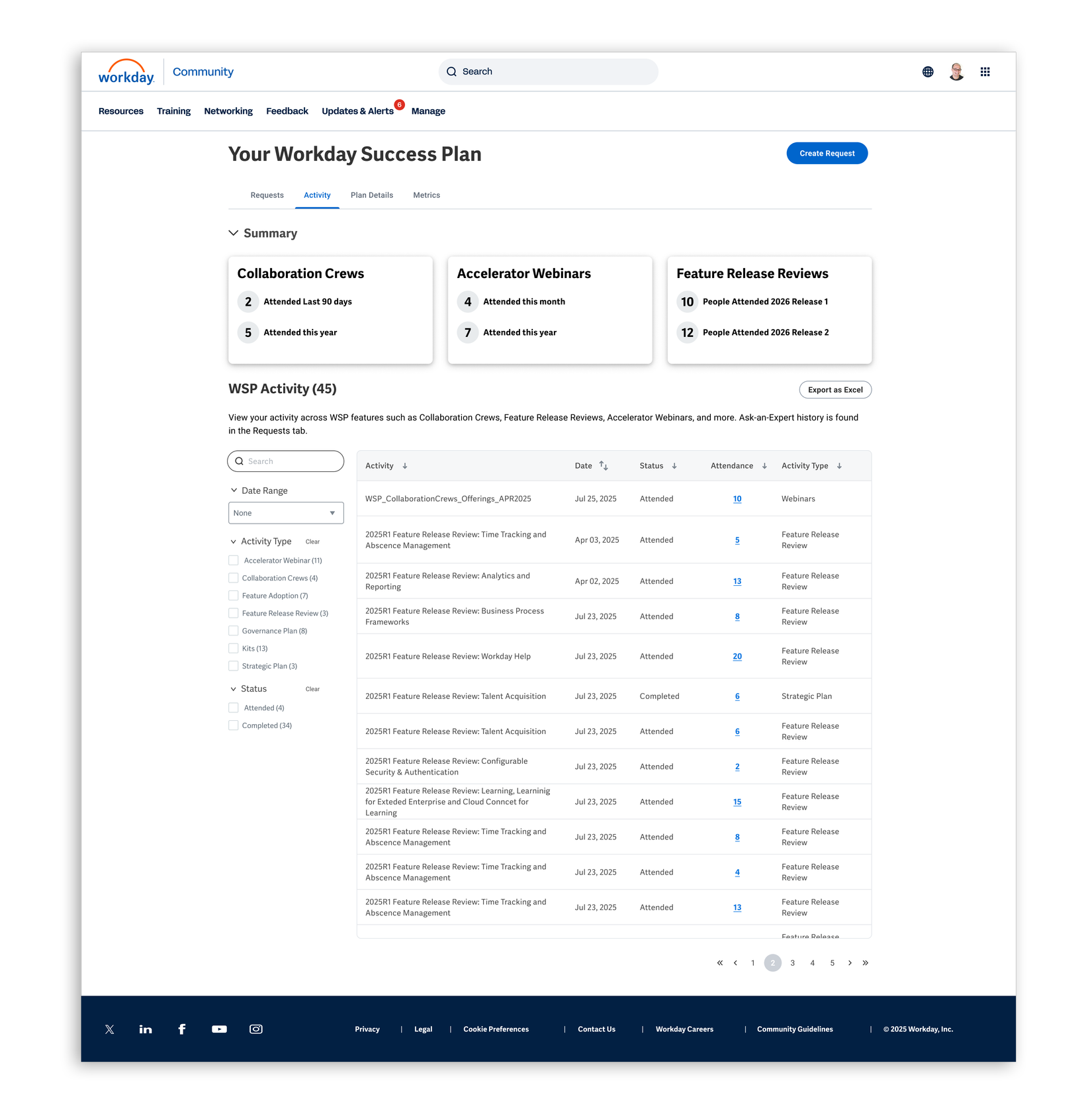
Activities Tab
We surface information about all activities not in the Request tab.
Client conversations showed a desire for more detailed activity data—such as who attended and when—with additional activity details planned on the roadmap.
Follow-up research confirmed interest in expanding this information further.
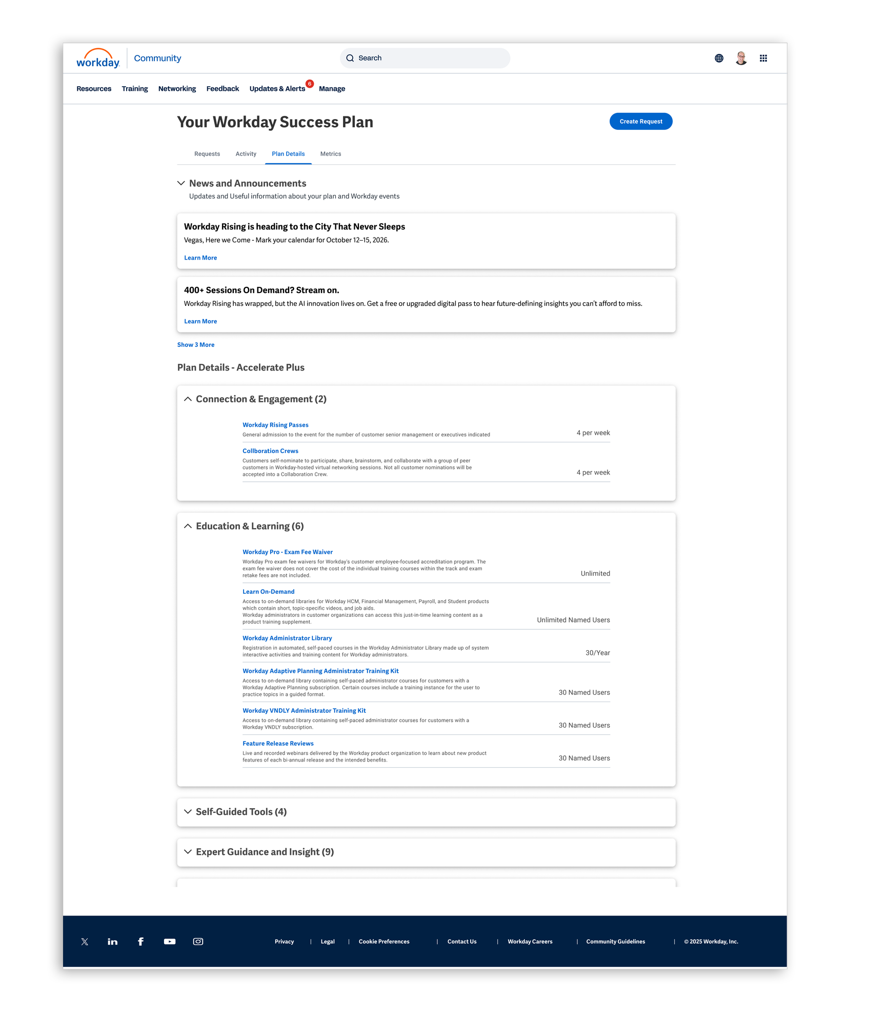
Plan Details Tab
Adding more context and insights to Plan Details was well received, with clients saying the previous design didn’t provide enough information.
The News and Announcements section was also seen as useful, with clear feedback on the types of content clients wanted most.
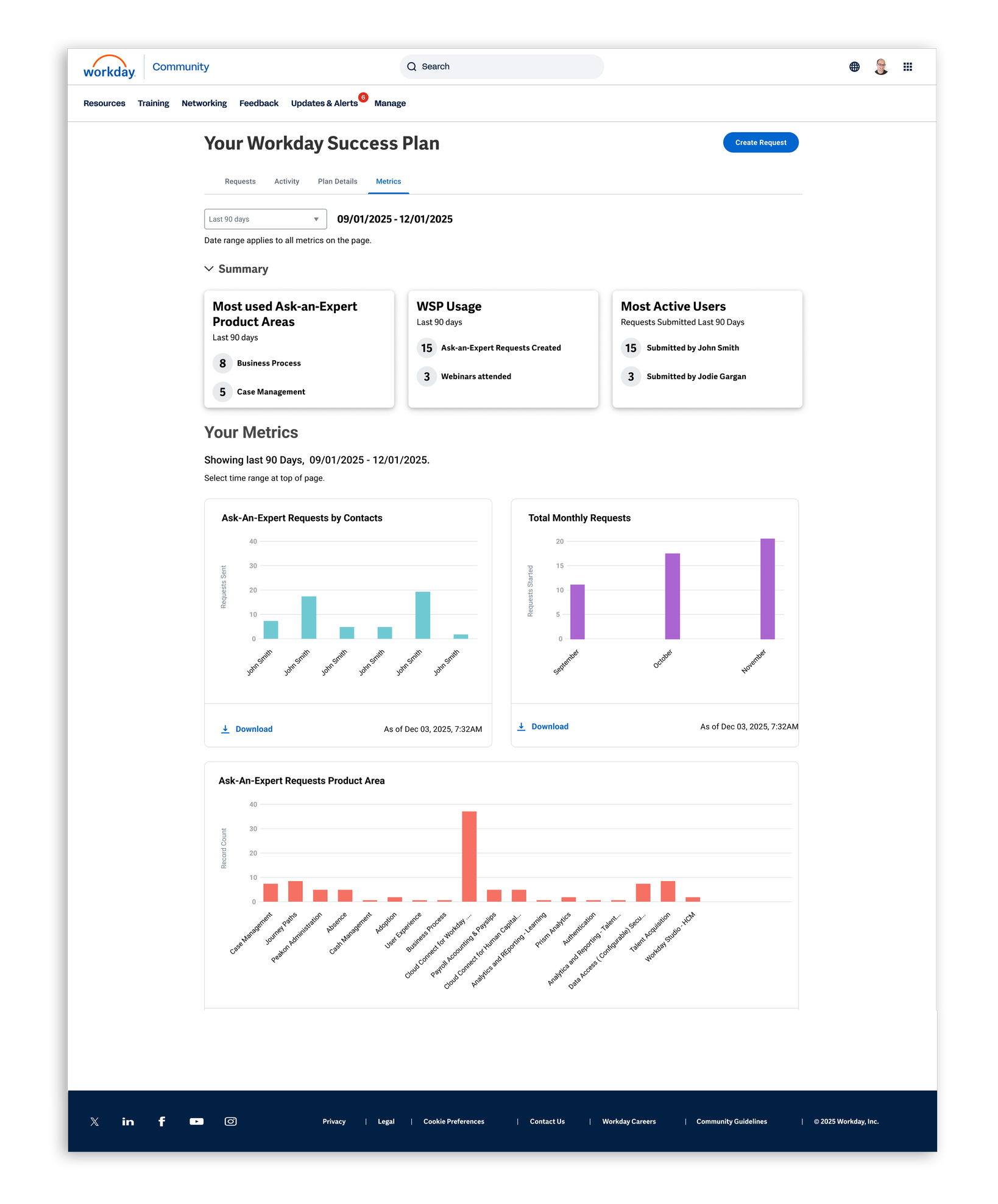
Metrics Tab
Clients saw the Metrics tab as a significant value add, especially for monitoring and reporting on engagement and activity.
How they used the data varied—some wanted reports, while others used it to manage their teams.
The strongest takeaway was a clear desire for more metrics across the product.
We went back to clients for a final sanity check.
The good news was the architecture held up, the tabs made sense, and the new insights closed a gap by helping clients better track and optimize their usage.
Takeaways
Creating early structure on the team was critical to aligning disparate stakeholders across multiple time zones and continents.
I spent a full week reviewing feature documentation to understand how this complex, expansive feature worked, enabling more effective questions with both the team and clients.
While I have extensive experience collaborating with researchers, this was my first time leading structured research directly—creating the research plan, defining questions, and recruiting clients.
In follow-up research, clients expressed strong excitement about the new design, particularly the summary insights and metrics.
One change clients did request was the ability to drill into summary insights to access more detailed information.